This tutorial was written by Katherine Walden (Digital Liberal Arts Specialist, Grinnell College). The tutorial framework was created by Sarah Purcell (L.F. Parker Professor of History, Grinnell College) and Sophia Gates Stern, student mentor for the class.
This tutorial was reviewed by Gina Donovan (Instructional Technologist, Grinnell College) and Lauren Frankel and Martin Toney, student workers in Grinnell College’s Data Analysis and Social Inquiry Lab.
This tutorial uses data generated by Cameron Blevins and posted on his personal site.

Introduction to Mapping Part I (Carto) is licensed under a Creative Commons Attribution-NonCommercial 4.0 International License.
Historians have long used spatial analysis, but digital mapping tools have made it possible for historians to explore larger and more complex spatial data sets. Northeastern University historian Cameron Blevins does this in his research on the relationship between state formation, westward expansion, and the U.S. postal service. In this tutorial, we will be using some of the data sets from Blevins’s research to learn more about some of the digital spatial analysis and visualization tools used in historical research.
How Blevins describes his research (from his personal site):
My current project is a spatial history of two of the defining projects of the late nineteenth-century United States: state formation and western expansion. Between the 1860s and the 1890s, the western United States underwent one of the most dramatic reorganizations of people, land, capital, and resources in American history. How did this happen so quickly, and across such a large and inhospitable area? Why were so many people willing and able to move to such shockingly remote places? How did the American state consolidate its control over this vast territory? I argue that the sprawling infrastructure of the U.S. Post holds the key to understanding the speed and scale of western expansion. Gossamer Network uses a database of more than 100,000 post offices to map the spread of the postal network in the western United States. This presents one of the most comprehensive and detailed spatial renderings of the nineteenth-century state that has ever been assembled.
This analysis leads to a series of new interpretations about the American state and the West. The U.S. Post was the era’s most spatially expansive institution. No other network, public or private, connected so many different people in so many different places across such a large area. It did so by operating what I’ve termed a “gossamer network.” The U.S. Post expanded across space by grafting the public functions of mail service onto the existing operations of private businesses: contracting with a stagecoach company to transport bags of mail, or paying a local businessman to periodically distribute letters from his general store. This flexible, ethereal structure allowed the U.S. Post to expand and contract across remote areas with a stunning speed. Its ability to move in lockstep with Anglo-Americans had enormous consequences for the West, accelerating a pattern of imperial conquest and settler colonialism while serving as the underlying machinery of governance in the region. Gossamer Network sheds new light on the familiar subject of western expansion and forces us to reconsider the very nature of state power during this era.
Preliminary reflection questions:
- What are Blevins’s research questions?
- Why (and how) is spatial analysis important to addressing those questions?
- What types of data do you think Blevins might work with for this project?
- Do you see any potential challenges or limitations in using spatial data as the foundation for this project?
Data:
1-Navigate to \\storage\projects\HIS\HIS-295-02\Postal_Data in File Explorer and copy the 1871_PostmasterSalary CSV file to your Desktop. Alternatively, you can go to the data page of Blevins’s personal site. Under the “Regional Data: Western Post Offices and Postmaster Salaries” heading, download the 1871_PostmasterSalaries CSV file.
2-Open the file in Microsoft Excel.
3-What fields are represented in the data? What questions do you have about the data?
4-Compare the original data source and what you see in the Excel table—what differences do you observe in how the data is represented? What types of questions do you think this data might be able to address? What gaps or absences do you notice in the data?
5-Save the file to your Desktop as a CSV. If Excel displays a warning message when you try to save as a CSV, click OK and continue.
A note on geocoding:
The process of adding spatial information to data or determining exact coordinates for locations is called geocoding. As you notice in Blevins’s data, the original data source does not include specific geocordinates for every post office location. Historically, gazetteer publications (essentially a phone book with locations and geocoordinates) were used to find place information for spatial data. Best practice for limited data sets is still to use a gazetteer to georeferenced spatial data, and the internet has increased the availability and searchability of gazetteers. However, manual geocoding is not feasible for many larger data sets. A variety of free and paid services offer automated geocoding.
The United States in 1871
One of the challenges in historical spatial analysis is maps, boundaries, and territories change over time. A map of the United States in 1800 looks very different than what we encounter in Google Maps or MapQuest. Explore a map of the U.S. that was drawn and published in 1871. Not all territories drawn on the map had been granted statehood in 1871. Consult a chronological list of U.S. states by date of admission to the Union to see what territories on the map would not have been recognized states in 1871.
Reflection questions:
- Why do you think it is important to understand the historical spatial context for Blevins’s data? What all do we know about context?
- How would something like knowing states’ dates of admission to the Union impact how we analyze spatial data?
- What features on the 1871 map stand out as significant?
Carto
Carto is a cloud-computing platform released in 2011 by developer Vizzuality. Written in Ruby and Javascript, Carto is designed to allow businesses to analyze and visualize spatial data without prior or detailed technical GIS knowledge. As we’ll learn in another tutorial, GIS programs like ArcGIS are not always intuitive and user-friendly. Carto was designed as an alternative, with a web-hosted option that doesn’t require a local installation, although Carto is available as open source software. The short version—users can work with Carto in the browser without needing to set up their own server to host the program. The web-based version of Carto is considered a “freemium” software—free for some types of users with limited web-based functionality with scaled pricing plans for long-term use. Anyone can register for a 30 day Carto trial, which is what we will be using in this tutorial.
6-If you do not already have a Carto account, register for a free 30 day trial. No billing and payment information is required to sign up.
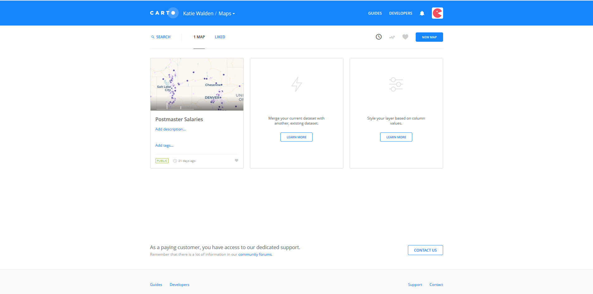

7-Log in to Carto. Next to your name in the top menu is a Maps icon with a dropdown arrow. Select Your datasets from the dropdown.

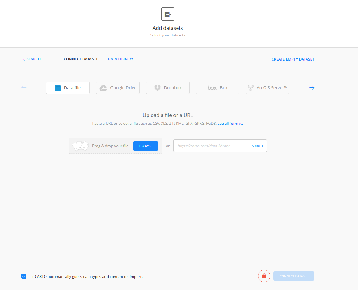
8-Click on the New Dataset icon in the upper right-hand corner of the page.
9-You can browse to select the 1871_PostmasterSalary CSV file from your Desktop, or drag and drop it into the upload section of the page.
10-Click the Connect Dataset blue icon in the bottom right-hand corner of the page to upload the dataset to Carto.

11-Once your data has been added to Carto, compare how the data was structured in Excel versus how it is structured and described in Carto. What similarities do you notice? What has changed? Why do you think Carto made these changes or added this additional information?
12-Click the blue Create Map icon in the bottom right-hand corner of the page.

13-Once you’ve created a map, you move into Carto’s builder environment. Use the four-step tour to learn more about Carto’s map editing page.
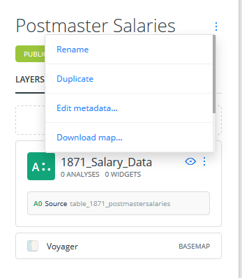
14-Rename the map by clicking on the three vertical dots next to the table_1871_postmas… header. Click Rename and change your map’s title to “Postmaster Salaries” or another descriptive phrase. You can also rename the map by double-clicking the title.
15-Let’s explore the map editing page. Use the plus or minus symbols in the bottom left-hand corner of the map to zoom in and out on the map. Double-clicking an area or using your mouse scroll wheel are also ways to zoom in and out.
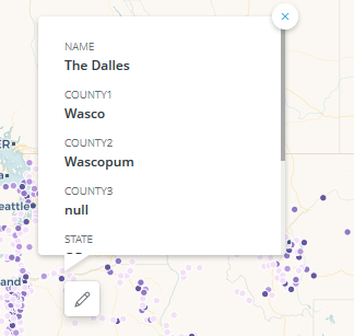
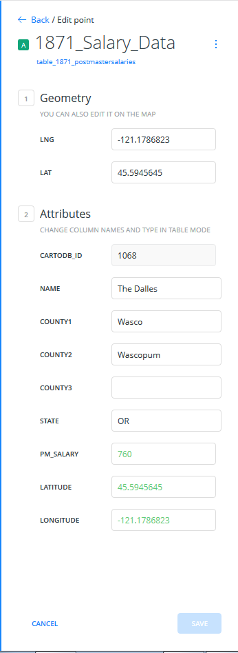
16-Click on any map point and click on the small light blue pencil icon that appears. Clicking this editing icon shows you that point’s attributes, such as its latitude, longitude, and other descriptive information. If needed, you could edit point data on this screen.
17-To exit looking at data points, click the Back arrow in the top left-hand corner of the page.
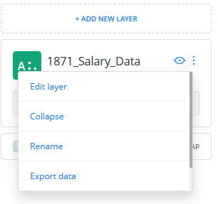
18-Although we are only working with one data layer in this tutorial, many mapping projects work with multiple layers so naming data layers is a useful practice. Click on the three vertical dots next to the data set’s title. Click rename and enter an appropriate descriptive name for the data set. You can also rename the data set by double-clicking the title.

19-Click on the dataset layer to move into Carto’s layer pane. Another brief tour can help you navigate the layer pane, which includes a menu with Data, Analysis, Style, Pop-Up, and Legend options.
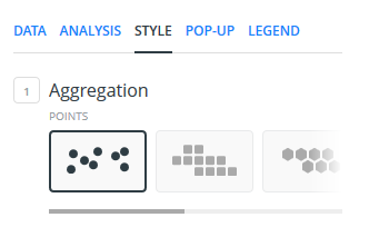
20-We’ll explore spatial analysis more in a later tutorial, but select Style from the layer menu. Aggregation offers different ways to visualize your data points on the map, from the default circular points to hexagons to heat maps and time animations. What types of aggregation are most effective for this data set? What types of aggregation do not work for this data set? What aspects of the data are highlighted in different aggregations?
21-The second option in the Style menu allows you to change the size and color of your data points. In Carto’s default settings, point size and color is standardized across all data points.
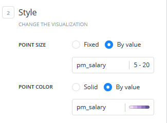
22-Under Point Size, switch the selection from Fixed to By value, and select pm_salary. Sizing points by value selects a data field and sizes points based on how frequently they appear in the dataset.
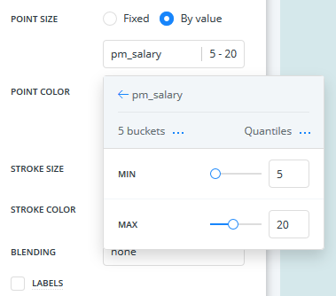
23-When sizing points by value, you can customize how many buckets (categories) you want to have, as well as how the distribution of those buckets is calculated. Carto’s default setting uses Quantiles to calculate bucket distribution, but you can select other ways to calculate those ranges.
24-What happens when you change the number of buckets, min/max values, or the way bucket distribution is calculated? What impact do these choices have on how your data is represented on the map? What factors would you need to consider when making these choices to accurately represent your data and analysis?
25-In addition to sizing points by value, we can also assign colors to points based on their value. Switch the Point Size selection back to Fixed, and switch the Point Color selection from Solid to By Value. Select the pm_salary value to recolor your points based on salary ranges.
26-Like with Point Size, Carto gives you the option of selecting your number of buckets and how those bucket ranges are calculated. You can also use one of Carto’s preset color palettes or build your own custom color set using a free online resource like Color Brewer. Carto also gives you the option to change the size of your points (point size), the size of your point outline (stroke size) and the color of your point outline (stroke color).
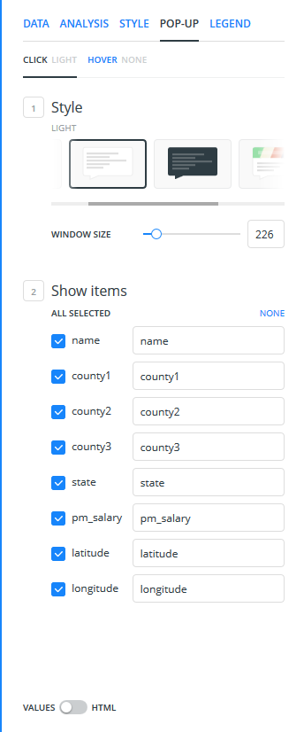
27-Select the Pop-Up icon in the layer menu. Pop-Ups include data that displays when you click on a specific map point. In Carto’s default settings, no customized pop-ups appear.
28-Select Click to design the pop-up that appears when you click on a map point. Select Hover to design the pop-up that appears when you hover over a map point.
29-For Click and Hover, Carto allows you to determine the size and coloring of the pop-up window, as well as what data fields are displayed (and how they are labeled).

30-If you wanted to further customize your pop-ups, Carto provides an HTML view where you could further customize the style of text in your pop-ups.

31-Once you are satisfied with the styling of your pop-ups, click the back arrow to return to the main editing page. Because Carto is a cloud-based service, it is saving edits as you make them. However, the map project will not be published or shared until you click the Publish blue rectangular icon on the bottom left-hand side of the page.
Extra time?
Making corrections to your data:
As we read in the introduction to this tutorial, this dataset includes spatial information about post offices located in the western United States. You have noticed three map points in the Mediterranean when you loaded the data into Carto. Open the editor for those data points and see what steps are needed to correctly geocode the data.
Additional features to explore:
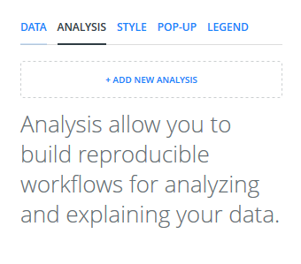
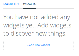
In this tutorial, we have been focusing on editing a data layer in Carto. The program also includes tools that let you analyze your data (Layers->Analysis) and add interactive widgets for a dynamic public interface.
